
As an organization, you face the challenge of scaling efficiently without compromising on quality and speed. A Design System is a crucial factor in this regard. It is not just a library of components, but a strategic investment that bridges the gap between design and development, thereby having a direct impact on costs, efficiency, and product quality.
By introducing a Design System, we create several key benefits:
⚡ For designers: Faster design, consistent output
✅ Reusable components & templates save designers a tremendous amount of time. New pages and flows can be set up much more quickly without having to rebuild the basics each time.
✅ Consistency across teams → All designers work with the same components, ensuring that the user experience remains consistent across all products and platforms.
✅ More focus on innovation → Since the foundation is already in place, designers can concentrate on user insights and improvements instead of pixel-perfect repetition.
⚡ For developers: Build more efficiently, fewer bugs
✅ Faster implementation → Developers can work directly with ready-made components and do not have to come up with new UI solutions each time.
✅ Fewer errors and inconsistencies → Design tokens ensure that styling is automatically applied without manual adjustments.
✅ Easy updates → A change in a primary color, spacing, or typography is immediately reflected in all linked components.
⚡ For documentation & version control: Less confusion, more control
✅ A central place for all design and code decisions → Everyone works from one source of truth, preventing miscommunication.
✅ Clear documentation & guidelines → New team members can onboard faster, and developers know exactly how a component works and what it is intended for.
✅ Version control keeps everything up-to-date → No chaos with different versions of a component. Everyone knows which version is the most recent and what updates are coming.
I use the Atomic Design methodology, which breaks down designs into smaller, reusable components. This approach helps create a consistent and scalable design system. The structure is as follows:
1. Atoms ⚛️ – The smallest building blocks, such as buttons, input fields, or icons.
2. Molecules 🧪 – Combinations of atoms that work together, such as a search bar or an input field with a label.
3. Organisms 🏗️ – More complex components made up of multiple molecules and atoms, such as a header or a menu.
4. Templates 📐 – Page structures that determine the layout and arrangement of content but do not yet contain final content.
5. Pages 📄 – The final result with real content, where all components come together into a complete design.
By following this systematic approach, you ensure clear, reusable, and consistent designs across all products.
In this design system, I use variables as design tokens to ensure consistency and flexibility across the various themes. Here's how it works:
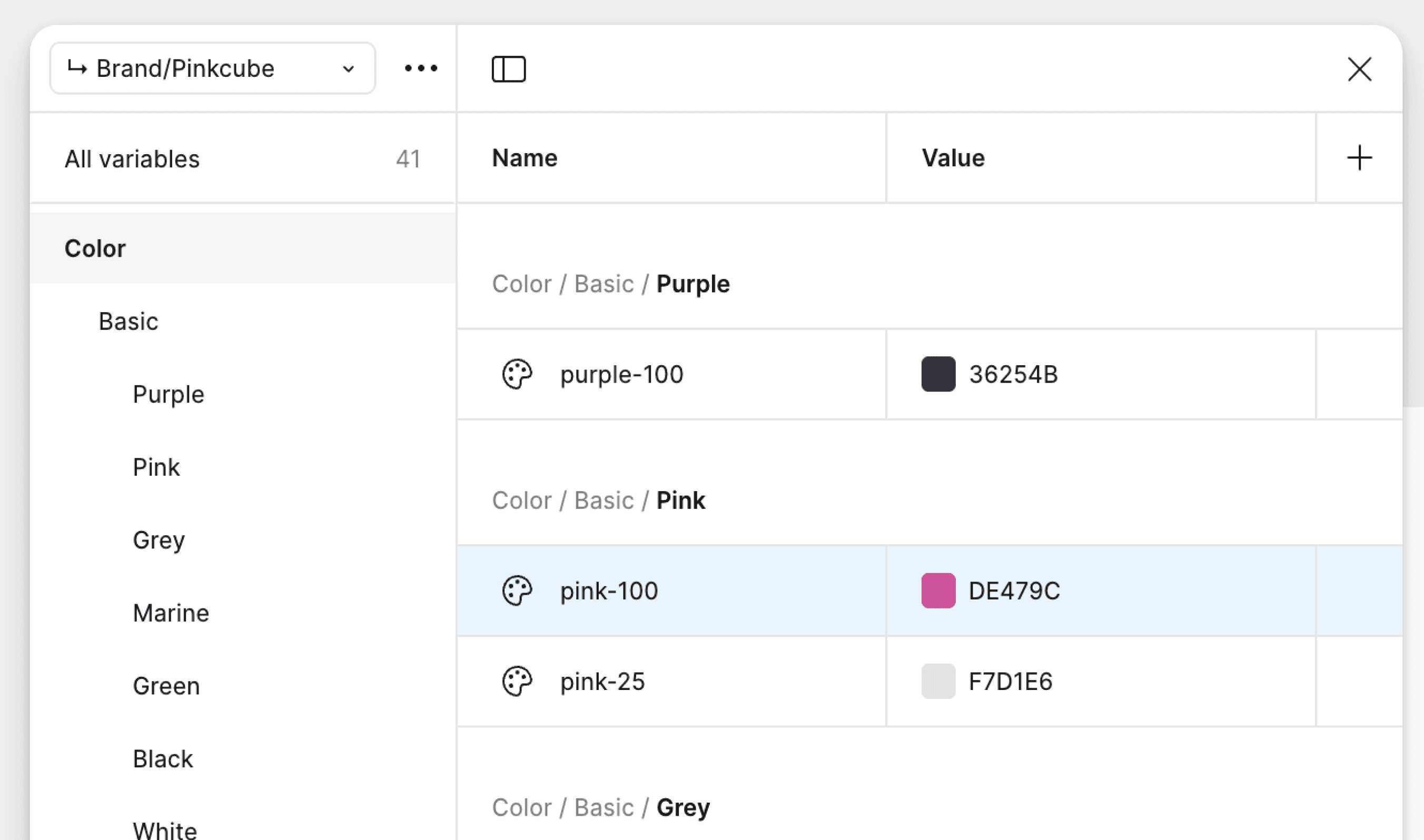
1. Global Tokens (Raw Values) 🌐
Global tokens form the foundation of our design system. They contain raw values such as colors, spacing, border and typography, which are defined per theme. These tokens standardize the core of our design and ensure consistency. Each token has a recognizable name, such as pink-100, allowing designers and developers to easily communicate and apply styles accurately across all projects.
2. Alias Tokens (Theme Styles) 🏷️
Alias tokens link the global values to specific design styles, such as surface-primary. This layer defines styles for all themes, enabling brand-specific designs without duplicating values. Additionally, we define the styling per breakpoint (mobile, tablet, and desktop) here.

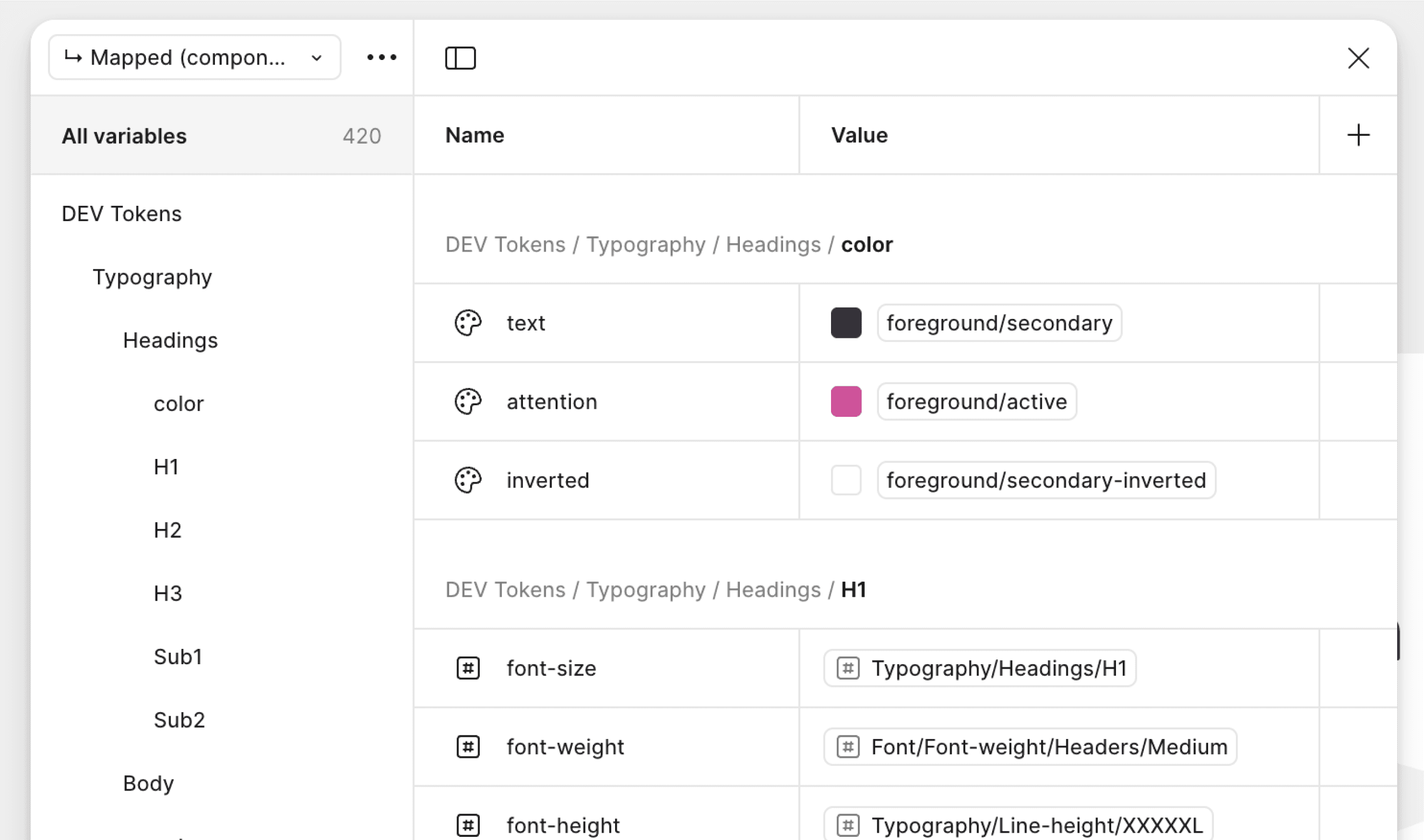
3. Mapped Tokens (Component Level) 🧩
At this level, alias tokens are directly linked to components, for example, surface-primary becomes bg-primary-button. This ensures that all components automatically use the correct styles as defined in our design tokens. We also define the behaviour of each component per breakpoint.

Thanks to this structured approach, the design system remains scalable, organized, and consistent across all products and brands.
By defining design tokens per breakpoint, designers now only need to design in one breakpoint. With a single click, they can automatically preview the design in other formats, such as tablet or mobile.
